Seattle IT Service Hub
IT Service Management Platform Redesign
Redesign the IT service desk interface for the City of Seattle and change the platform’s language to be more user-centric.

Role | Interaction & User Interface Designer
Skills | Research, Prototyping, UI Design, IA
Duration | 2.5 Weeks
Tools | Adobe XD
Teammates | Sarah Hawkinson Patil - User Researcher, Peter Thompson - Project Manager
Overview
Our client for this project is the City of Seattle’s IT department. They currently have a semi-functional prototype for their IT Service Management (ITSM) platform - IT Service Hub. It’s a cloud-based application that builds upon the IT Infrastructure Library framework. The target users are the 13,000 city employees who work for Seattle.
However, city employees without prior IT knowledge have a difficult time understanding the language of the request offerings (ROs) in the service catalog when they need to submit a request, which causes them to deviate from using the IT Service Hub.
How can we help?
By changing the language of the platform from IT-centric to client-centric, more users will be able to find what they want in the service catalog as the experience becomes more intuitive. Thus, this change will encourage them to use the tool by increasing user familiarity and learnability.
Strategy & Scope
We will implement updated language (specifically Request Offering titles and descriptions) and redesign visuals based on research data in order to make the IT Service Hub experience more intuitive to the average target user, with the intent of creating consistency across the platform. The primary UX disciplines involved in this project are Information Architecture and Content Strategy, both which our team collectively worked on.
Since we only have a limited time to work on the project, we needed to set a realistic scope of work. Upon the client’s request, our priorities are the home page and service catalog page. We will focus on the specific language, content hierarchy/information architecture, and visual elements of the pages. The measurement of success for this project will be based on user acceptance and desirability of the tool, which can be inferred from positive user feedback and an increase in the amount of successful requests.
Comparative Analysis
For design inspiration and knowledge foundation of service desks, I researched other ticketing/service desk platforms’ homepages to better understand the common features and layout.

Based on the interviews conducted by our Researcher Sarah, we arrived at the following key issues associated with the current IT Service Hub.
Pain Points
Unable to intuitively find the right service
Not having enough information upfront
Not knowing the status of requests
Delayed, unfulfilled, and wrongly fulfilled requests
User Needs
Sufficient and decipherable information about services
Consistent updates on the status of requests
More digestible interface that’s easier to navigate
Logical and accurate flow of submitting a request
Persona
Based on the identified pain points and user needs, we constructed a persona to humanize the users.

Michael is a goal-oriented individual who wants things done efficiently. He values his time as he enjoys a work life balance. He feels frustrated by overly complicated tasks and dealing with unfamiliar terminology. He wants to feel empowered, establish clear communication, and have a simplified workflow.
Storyboard
To better illustrate the problem landscape, I used a storyboard to showcase our persona’s frustration with the IT Service Hub and his eventual loss of faith in the service as he opts to calling. Michael is a staff for the City of Seattle. He has a tough time trying to request the correct service he needs using the Service Hub due to the complex nature of the IT-oriented language, which makes navigating the Service Hub difficult and requires a relatively steep learning curve.
User Flow
Stemming from our project scope, I created a user flow that consists of the navigation from the home page to requesting a particular service.
Information Architecture
I did a card sort to analyze the current structure of the service catalog’s filter categories. I listed out all the sub-categories on post-its and identified some repetitive terms to better understand where existing issues lie. I then regrouped all the items and renamed the parent categories based on the content of the post-its. For my wireframe and iterations, I labelled the filter categories using the newly-derived names.

Design Rationale
After consolidating the data we collected from the interviews, we analyzed some potential design changes we could implement and propose to the client. I started out with some preliminary sketches to get an idea of the layout of the home page. I also analyzed the current language and tried to brainstorm some alternative solutions to create consistency and improve user understanding.
Client’s Original Prototype
From our round of baseline usability testing on the original prototype provided by our client, we identified several issues regarding both the visual appearance and functionality.
Initial Wireframes
I then created wireframes for the home page and service catalog page to test our redesign solution.
Visual Mockups
For the next rounds of usability testing, we tested with high-fidelity mockups to directly address and obtain user feedback on the visual aspects of our project. We continually updated the language of the services based on users’ mental models. I designed two sets (A/B) of home page and service catalog page to test which one users prefer based on a style guide created by our PM - Peter.

The primary difference is the size and content of the banner image. Users preferred A.
Based on results from our first round of usability testing, users had a difficult time noticing the search bar. So in Version A of our first iteration, I adjusted the placement of the search bar to have a higher visual hierarchy, separate from the lower section. However, due to the platform’s structural limitations on the service catalog page, we decided to stick with the original layout, which is Version B.
First Iteration
The following images are before/after comparisons to show our iteration process from Version 1 (wireframes) to Version 2 (higher fidelity mockups).
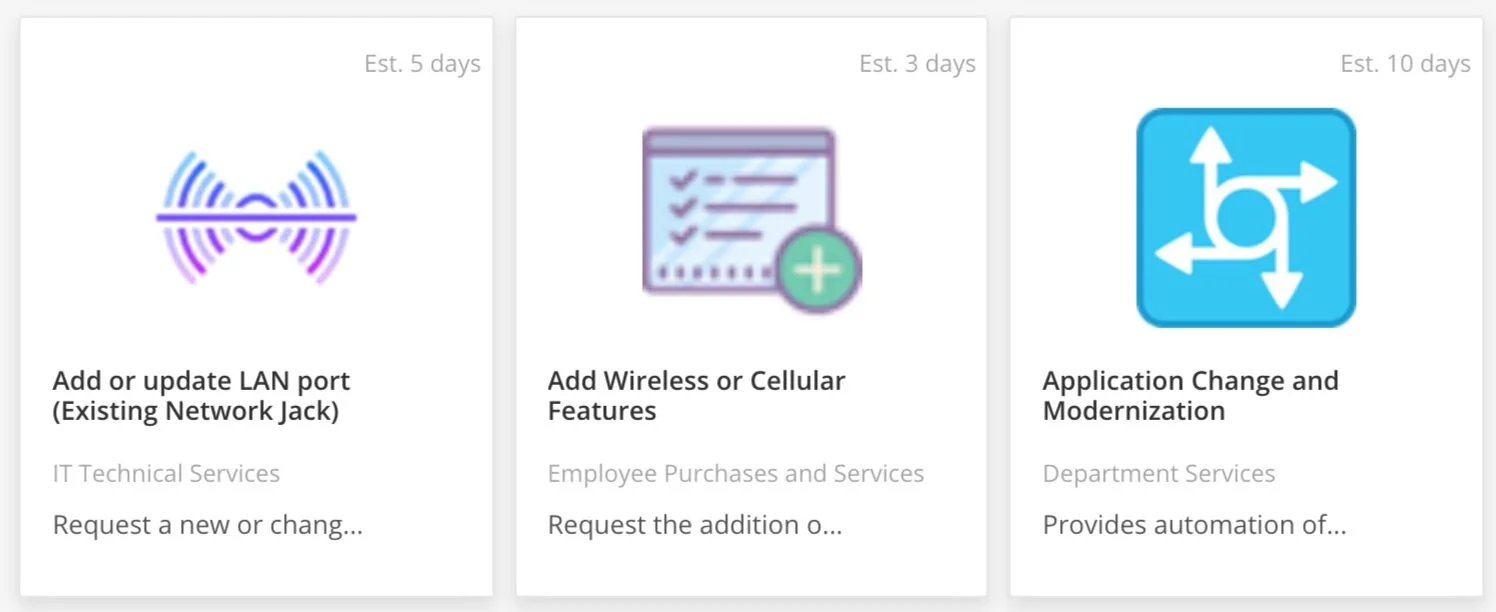
For prototyping and usability testing purposes, we focused on two request offerings/services. Based on user feedback and our own interpretations, we updated the language of the two services, including the title, description, and keywords to make the experience of finding the right service more intuitive for the user. Besides these two services, we also compiled a list of updated language for other services (about 54 total), primarily focusing the most common requests (about 15 total).
Second Iteration
Upon the client’s request, I also looked up more suitable free icons for the request offerings. I chose icons with a more consistent style and in accordance with the color palette.
Credits: Flaticon.com
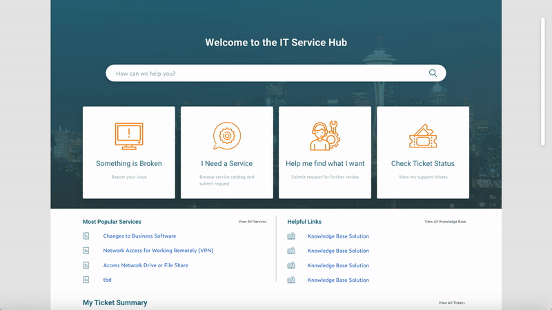
Final Prototype

Reflection + Key Takeaways
This project was my first time working with a client, which gave me a perspective on the difference between working within a class setting as compared to having real stakeholders involved in the project. Over the course of the project, I learned that our assigned roles are not definitive and we need to be flexible with our responsibilities to better match the project goals. Our group collaborated closely on every phase of the process as our roles had crossovers.
A key takeaway from this project is the importance of setting realistic goals and scope for ourselves to be in line with our time constraint. There were a few challenges our team faced that hindered our progress in the beginning phase of the project, including delays due to setting up internal accounts and background checks. We adjusted our schedule to accommodate accordingly as we learned to be more flexible with an agile workflow. Regarding the design process, we had to keep in mind the limitations of the platform and consistently seek clarification of some IT language from our clients, which helped foster our close communication with them.